Wall art looks best when it feels intentional, not merely centered by instinct. The practical answer to how high to hang pictures starts with a reliable eye-level rule, then adjusts for sofas, beds, consoles, mantels, gallery walls, and staircases. I’ll walk through the measurements I actually use, where to bend them, and the mistakes that make a room feel slightly off even when the frames are level.
These measurements keep wall art balanced in real rooms
- Use 57 to 60 inches from the floor to the center of the artwork as the default for a single piece on an open wall.
- Above furniture, leave roughly 6 to 12 inches between the top of the furniture and the bottom of the frame.
- For gallery walls, measure the center of the entire composition, not each frame on its own.
- Keep art proportionate to the furniture below it; a width of about two-thirds of the furniture usually looks right.
- Choose hardware for the wall type and the piece’s weight before you mark any holes.
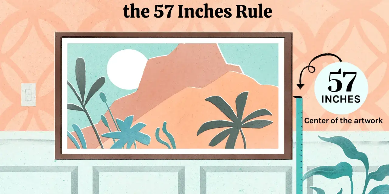
Use the 57-inch rule as your default
The cleanest starting point is simple: hang the center of the artwork about 57 inches from the floor, and in some rooms I’ll let that creep up to 60 inches if the wall or furniture says so. That height lines up with average eye level for many adults, which is why it tends to feel calm instead of floaty or cramped.
The detail people miss is the reference point. You are not measuring to the top edge of the frame, and you are not measuring to the hook. You are measuring to the visual center of the piece. If the frame is 24 inches tall, the midpoint sits 12 inches from the top and bottom, so the hanging point needs to be adjusted accordingly.
- Measure 57 inches from the floor and mark it lightly on the wall.
- Measure the total height of the frame or canvas.
- Divide that height by two to find the center.
- Subtract that number from your 57-inch mark to find where the hanger should land.
That one method solves most empty-wall situations. Once you can place a single frame cleanly, it becomes much easier to adapt the same logic to furniture walls and grouped arrangements.
Adjust the height when the art sits above furniture
Furniture changes the equation because the art has to belong to the object beneath it instead of floating on a blank wall. My rule of thumb is to leave a visible gap, but not so much that the frame feels disconnected. In most living rooms that means a tighter, more deliberate relationship than people expect.
| Placement | Good starting gap | What it should feel like |
|---|---|---|
| Above a sofa | 6 to 8 inches above the back | The art should read as part of the seating area, not as a separate object drifting above it. |
| Above a console or buffet | 6 to 10 inches above the surface or tallest decor item | Leave enough room for lamps, vases, or a bowl without crowding the frame. |
| Above a bed or headboard | 6 to 10 inches above the headboard | Keep the piece centered over the bed so the wall looks anchored instead of top-heavy. |
| Above a mantel | 6 to 12 inches above the mantel shelf | Maintain breathing room and be conservative if the fireplace throws heat. |
I like to think in terms of visual connection. If the art is too far away from the furniture, the room starts to feel cut into separate layers. If it is too close, the wall feels crowded. The sweet spot is the range where the frame and furniture work as one composition without touching.
That spacing logic changes again once you leave a single-piece setup and start building a larger arrangement.
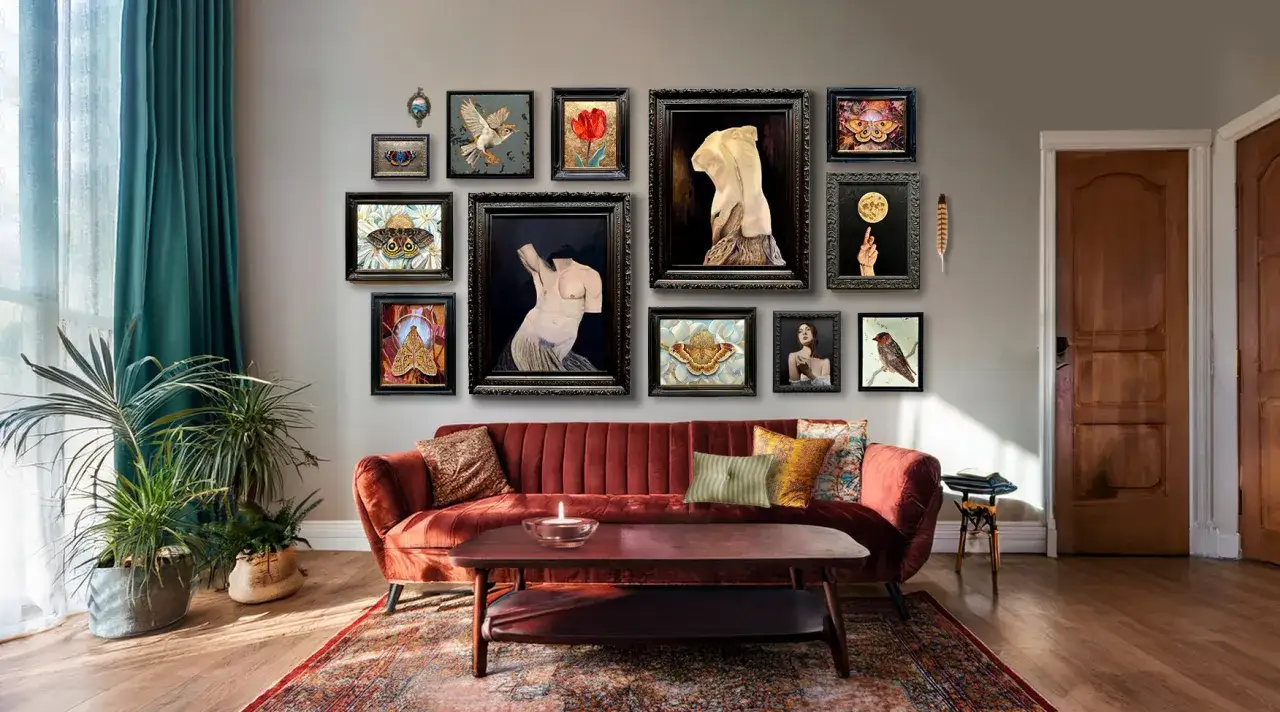
Measure the whole composition for gallery walls and staircases
Groupings are where good instincts matter more than rigid formulas. For a gallery wall, I ignore the urge to center each frame independently and instead measure the center of the full arrangement. That means a cluster of six frames, a triptych, or an asymmetrical mix still gets treated as one visual block.
For a clean gallery wall, keep the gaps between frames consistent. Two to three inches usually looks controlled without feeling stiff. If the pieces are very different sizes, I start with the largest one near the middle of the arrangement and build outward, because that gives the wall a clear anchor.
Staircases are the main exception to the eye-level rule. The art should follow the diagonal line of the stairs instead of trying to force a level horizon through the whole run. A practical approach is to align the center points along the rising stair line and keep the spacing visually even as you move upward. If the staircase turns into a landing, that landing becomes a new focal wall and deserves its own center point.
When I’m unsure, I lay the pieces on the floor first or tape paper templates to the wall. That extra step saves far more time than re-drilling holes later.
Keep the size and proportion in sync with the wall
Height is only half the equation. A frame can be technically correct and still look wrong if it is too small for the furniture or too wide for the available wall. The usual design shortcut is the two-thirds rule: the art, or the full grouped arrangement, should take up about two-thirds of the width of the furniture below it.
That guideline matters because proportion changes how high the piece feels. A tiny print hung at the “right” height can still look like it is drifting away from the room if it is undersized. A larger piece can sit a touch lower and still feel balanced because it visually belongs to the furniture.
- Use a larger single piece when the wall is open and the furniture is low.
- Use a diptych or triptych when one frame would feel too narrow.
- Use a tighter cluster when the wall is busy and you need the art to read as one object.
- Leave more negative space around a statement piece so it can breathe.
This is one of the places where I see the biggest mistakes: people focus on the nail location, when what really needs fixing is scale. Get the proportion right and the height usually falls into place much more naturally.
Choose hardware that matches the wall and the weight
Even a perfectly measured frame is a bad install if the hardware cannot support it. The wall material matters as much as the art itself. Drywall, plaster, brick, and tile all behave differently, and each one asks for a different fastener strategy.
- Light frames can often use picture hooks or removable adhesive strips if the manufacturer rating fits the weight.
- Medium pieces usually do better with a nail or hook rated for the frame’s actual weight.
- Heavy artwork should go into studs or proper wall anchors rather than a casual nail.
- Plaster and masonry need the right drill bit and the right anchor, or the wall itself becomes the weak point.
I also check the hanging style on the back of the piece before I start. A sawtooth hanger, D-ring, wire, or French cleat changes where the weight sits and how much the piece can shift after it is mounted. If the wall is valuable, textured, or fragile, I’d rather spend ten extra minutes measuring than patching a mistake later.
The practical lesson here is straightforward: the best height is useless if the piece is hanging on hardware that will not stay put.
Avoid the placement mistakes that make rooms feel off
The most common problem is not a crooked frame. It is a frame that is technically level but visually wrong. Hanging art too high is the classic issue, especially when people try to “give it room” and accidentally disconnect it from the furniture or the line of sight. That often makes the wall feel thinner and the room less grounded.
Another common mistake is measuring from the wall itself instead of the room around it. A picture can be centered on a blank wall and still feel off if it ignores a sofa, doorway, lamp, or mantel nearby. The eye reads relationships, not isolated measurements.
- Do not place every frame at the same top height if the pieces are different sizes.
- Do not spread a gallery wall so wide that the gaps start to dominate the display.
- Do not hang art so low that it nearly touches furniture unless you are intentionally layering it.
- Do not trust the room by eye alone if the wall is tall, sloped, or asymmetrical.
When a wall looks wrong and I cannot immediately explain why, I usually check three things: the center height, the spacing above furniture, and the scale of the art. One of those is usually the real problem, and the fix is often simpler than the first draft suggested.
Use a paper mock-up before you make the first hole
The fastest way to get a clean result is to test the layout before you commit. I trace each frame onto kraft paper or use painter’s tape to mark the outline on the wall, then step back and look at the composition from the doorway, sofa, or hallway you will actually see it from. That view matters more than standing directly in front of the wall.
Once the paper shapes feel right, I mark the center point, confirm the hanger location, and level the first piece carefully. After that, the rest of the arrangement is easier because the wall already has a visual anchor. If you are hanging several frames, this method also helps you keep the spacing consistent without turning the room into a measuring exercise.
So if you want the short version, this is it: start around 57 inches to the center, pull the art closer to furniture when needed, and treat every grouped arrangement as one composition. If two heights both seem plausible, I usually choose the lower one for furniture walls and the slightly higher one only when the wall is truly empty and expansive. That is the most reliable way I know to make picture height feel intentional instead of improvised.